HANA’S

BRAND IDENTITY | SPRING 2026
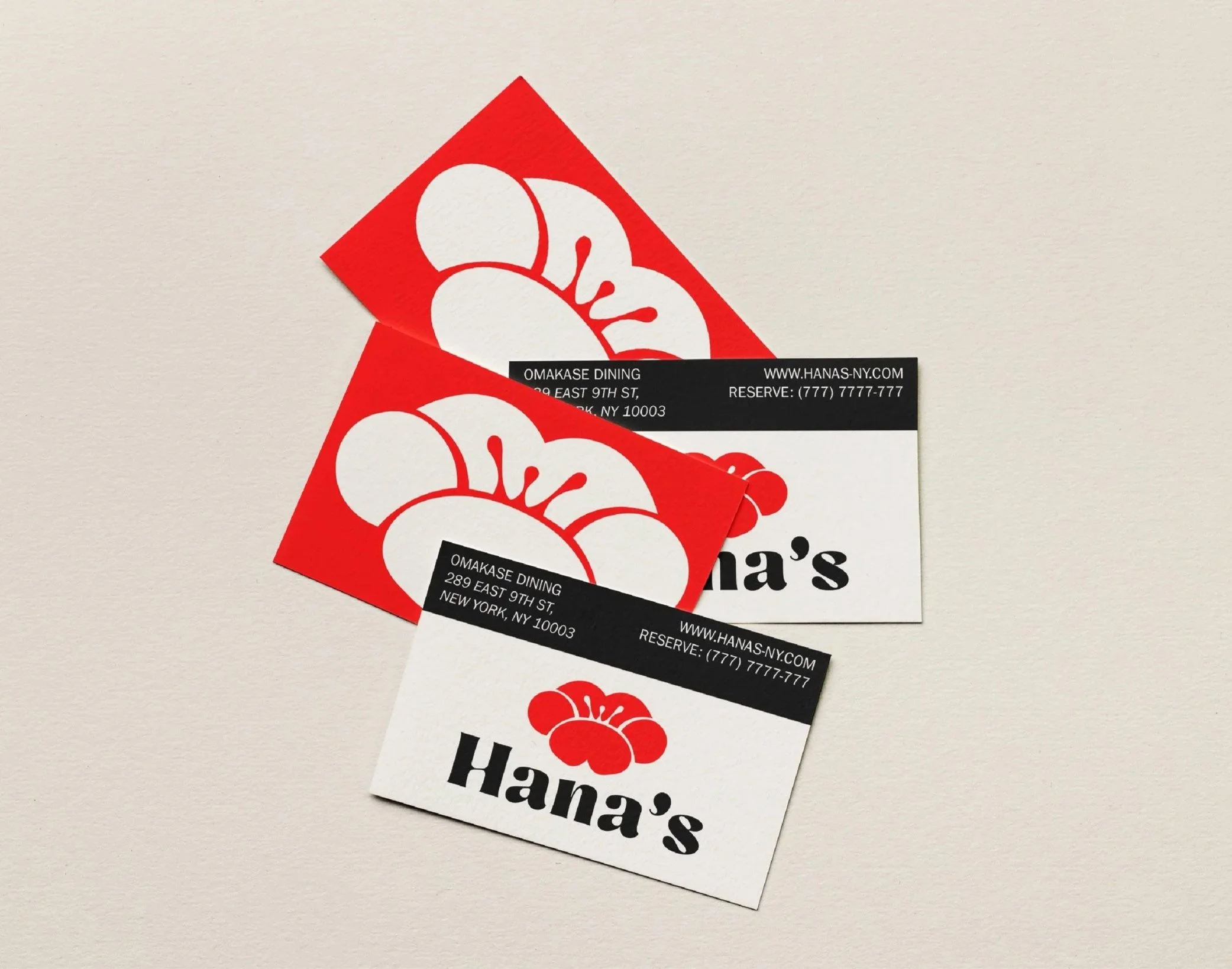
A self-initiated brand concept for a quaint omakase restaurant in New York City. The system spans color, typography, logo variants, and print collateral.
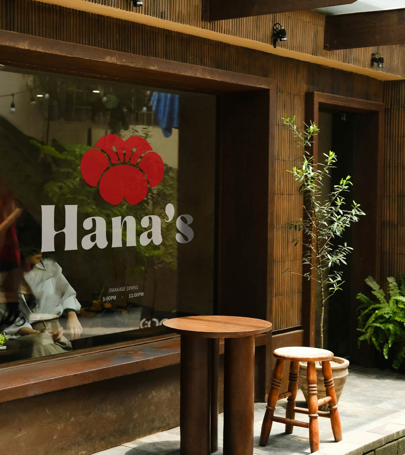
Hana’s identity speaks with rounded silhouettes and a warm pragmatism. The logo mark is inspired by the red ume blossom.

The mark holds reversed, multipled, and isolated. It has strong potential for orientation flipping or a repeated motif



PURE RED
#FE0000
SAFFRON
#FFC512
CELADON
#AFDEB9
LACE
#F7F1E5
PURE BLACK
#00000
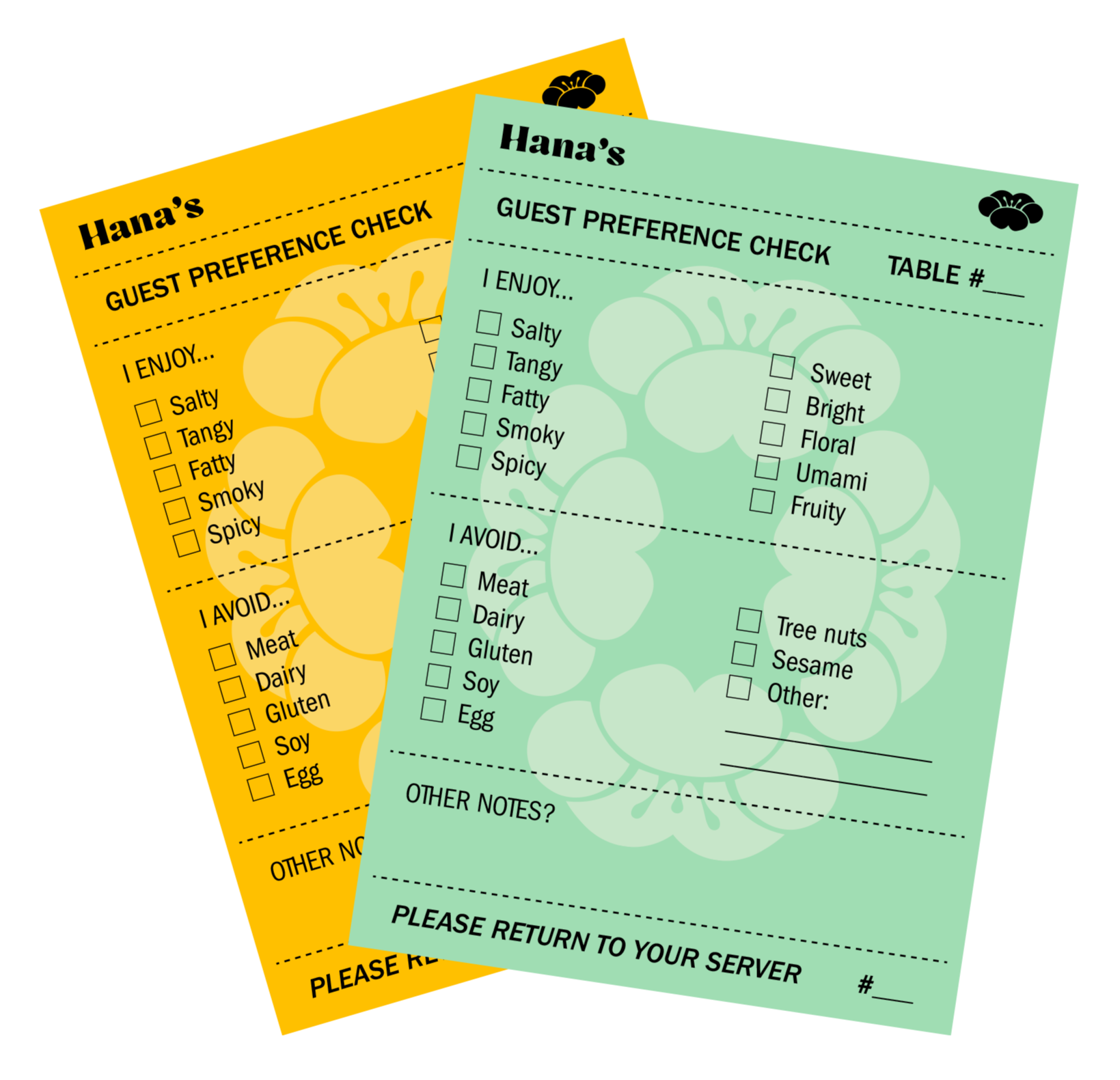
I wanted a functional designed item that elevates the experience, which ended up being notepad menus. Hana’s notepads are used to check off what you like, dislike/allergic to, and other preferences.

Variation in line weight of flower to mimmic mezzotint.